Call-to-Action is a crucial factor in determining the success or failure of your marketing campaigns. It all depends on the right words- If you use the right words, your call to action will encourage people to take action. On the other hand, the wrong CTA will only make them scroll past it. If you want to make your marketing campaign a success, you need an effective CTA that your potential audience can’t help but click it.
Look at our own case, how many times we have signed up for something just because of the design of the CTA or the eloquent guidance during the process of sign-up? Trust me, if it hasn’t been for strategic CTAs we will be using much less apps and websites.
Through this blog, we will be discussing 10 call-to-action examples that will help to boost your conversion rates. We will also dig into everything that you need to know about CAT.
What is Call-To-Action (CTA)?
A call to action is exactly what the word conveys- a call or text prompt for your target audience that will inspire them to take some kind of action on your application or website. Speaking with an example, an effective CTA will encourage your audience to click on a link or make a comment on your social media post, click through an online store, sign up for email, etc.
The prime objective of CTA is to help you with conversion strategy by guiding your users and telling them what to perform next. Based on your content goal, CTA will help you boost varieties of actions.
Why Call-To-Action is Important?
Call-to-action is a great marketing strategy and it is highly important for effective marketing campaigns. CTA will boost conversion rates by guiding your audience through the buying journey. The right and effective CTA will bring out astonishing results in leading visitors to your website or getting their contact information that you can add to the marketing funnel.
Call-to-action will inspire people to take deliberate actions which will help you in many ways such as social reach, sales lead, increase in profit or subscriptions, and many more. How can we come up with the right and effective CTA?
Let us now look into the ways you can write a compelling call-to-action marketing.
Tips to Write Persuasive Call-To-Action
- Make it Clear and Catchy
The clear and catchy verb form will encourage people to do actions. Even if your visuals are compelling, people want the right guidance to follow the process. Thus convey your target audience with clear communication and try to make it brief but persuasive.
For example: “BUY NOW” or “Swipe Up“
2. Longer CTA to Stimulate Emotion
If you want to provoke your target audience, you will need a longer CTA. Also, make sure you approach them in a more personal way so that they don’t get a more vibe of you being a marketer.
Some examples are:
“Buy now to get 70% off“
“Find your dream Home from us“
3. Sense of Urgency
Creating urgency will prompt people to take immediate action. It is ideal to use a time-limited offer which will urge the customers to take faster actions.
For example: “Order within 24 hours to get free shipping“
“Reserve my seat“
3. Come Up with Something Creative
You don’t have to always follow in the footsteps of others, explore your inner creativity to understand your target audience and find a way that will inspire them to take action on your website. Based on your requirement choose the effective CTA. In the majority of cases, the first attempt of CTA might not work so it is advisable to run one or more A/B tests to understand how strong and effective your Call-to-actions are.
What is Call-To-Action Button?
These are the buttons that you use on the landing page of your website to guide your users toward your goal. It is a part of the landing page that will prompt actions from users which will help in conversion rates. CTA buttons come in different sizes and styles and choose the right one based on the type of your website.
Examples of CTA Button:
“Sign-Up” Button
The “Add to Cart” Button
The “Download Now” Button
Some of the factors to consider in the CTA Button are as follows:
The Text in CTA Button
The text should be brief, clear, and simple to expect immediate actions from your users. Further details will leave them confused and they just scroll past it. Try words such as “Get” or “Reserve” which should also go along with the text relating to your content, such as:
“Get a Free Trail“
“Reserve your Seat” etc
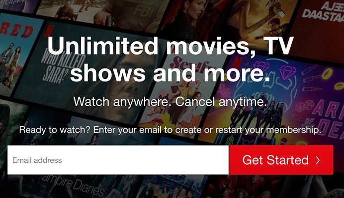
Let us understand better by taking the example from Netflix. Here the CTA button form is designed in a way that is easy for the eyes and doesn’t use any aggressive tone which invites the audience to get started. Thus it is essential to use simple, specific, and catchy text for your CTA button which will facilitate your visitors to take immediate action rather than leaving them confused.
CTA Button Color:
At first glance, your website should be impressive for your audience. The color of your Call to action button should match the background of your website or you can develop effective hypotheses that the website background is in contrast with the button color which will draw attention from your users.
The color combinations should be attractive. For instance, you don’t want a black color button for your website with a black background. To know the best color match that works for your website, it is better to do testing.
The Right Placement of the CTA Button
The right placement of your CTA button will help in immediate action. If you place them somewhere which is not easy to find you will lose conversion rates. In many cases, placing the button below the folds helps in increasing the conversion rates but it also depends on the button color and the space and size of the button.
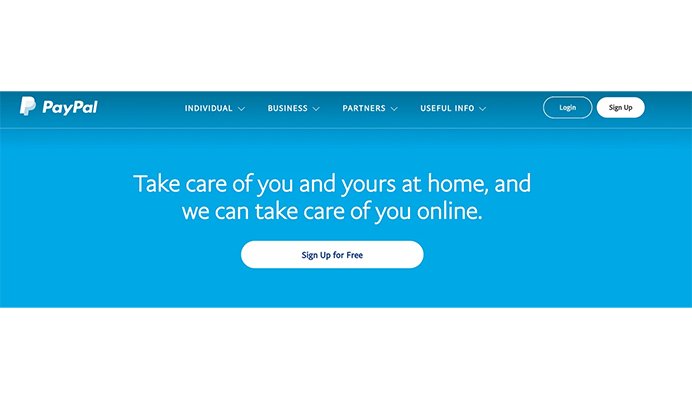
For example: see how PayPal use a chunk of white space in their button to draw their visitor’s eyes in the right direction. They have also placed the button next to the main text so that it does not feel disconnected from the main text.
What is QR Code Call-To-Action?
We all have used QR codes for various reasons it can be to book a reservation, to avail of a promo , or for accessing links. QR code call to action is another marketing strategy to draw attention from potential customers and encourage them to do action.
You can use compelling text for your QR code call to action such as “Scan me“, “Learn more” or what works for your own website.
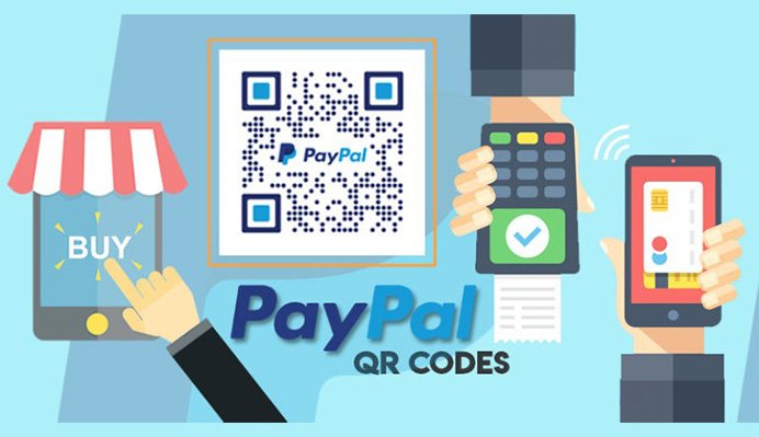
For example, PayPal uses QR codes to make payment much easier. The idea of cashless transactions will attract many customers and millions of users are already using PayPal for quicker purchases and easier transactions.
Some of the platforms where QR codes are used:
- Social Media Platforms
- For Video Advertisements
- For Sales and Promos of the Brand
- Website or Landing Page Redirection
- To Access Files
- To Download Apps
- Subscribing to Newsletters
- Digital Business Card
- Wi-Fi Access
- For Registration
10 Call-To-Action Examples
Let us now get into the examples of CTA that will help in instant leads.
1. “Sign Up For Weekly Goodies” – The BudgetNista

The BudgetNista is run by personal finance educator and author Tiffany Aliche. She gives complete advice and content regarding personal finance. As we can see she is also great in coming up with catchy CTAs. Instead of using boring CTA such as “Sign up for my newsletter” she used clickable text such as Goodies which makes it more interesting and fun.
2.”I’m In” – Glossier

The beauty brand Glossier has already taken a step ahead by using realistic people with different skin types and colors and through their website they have given a great call-to-action example. The website is designed in a neat way with lots of white background that gives a great pop-up for the picture of the model. The “Let’s take this to your inbox” term is an excellent way to convey people to sign up for their newsletter. And instead of Sign-up they used CTA “I’m in” which completes the process.
3. “Join Free For a Month” – Netflix

The main issue people have before joining or subscribing to a platform is the trouble to cancel the subscription. Netflix came up with an amazing CTA strategy by using the phrase “Cancel anytime” right next to their CTA “Join Free for a Month“. This will attract the viewers that will further encourage them to take action on their part. Netflix also used the color contrast of using a red logo for their black background which would attract their viewers.
4. “Let’s Start a New Project Together” – EPIC
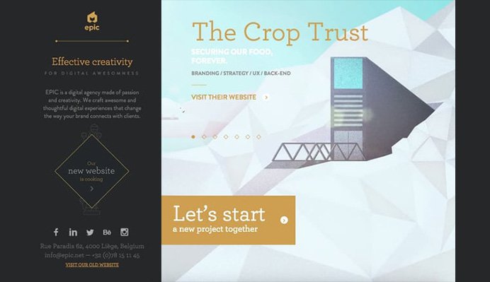
Another excellent call-to-action example is from the agency EPIC. They came out with a really interesting page, initially broadcasting through animated pictures and videos of some of the works they have done. Their main CTA which is “Let’s start a new project together” comes in contrast with the background which is a great way of presenting. The text itself brings out a friendly vibe which is ideal for users looking for creative partners and the text also conveys trust which is a key factor audiences look for.
5. “3 Months Free” – Amazon Music
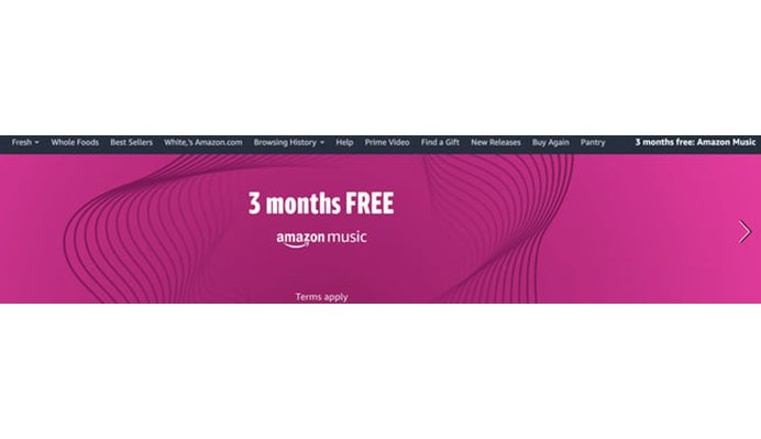
Amazon music uses a colorful yet simple design which is the two ideal strategic Call-to-action placed. The key factor that attracts the viewers is the “3 Months Free” CTA used in them. They are letting their audience enjoy Amazon music for three whole months. The way they presented it in a simple yet colorful way impresses the viewers and encourages them to take action.
6. “Shop the Lookbook” – Ashley Stewart

Ashley Stewart is a clothing brand designed for plus-sized people. Their web page is designed in an interesting way of capturing pictures of models and placed like a collage of images that attract website visitors. Their CTA which is “SHOP THE LOOKBOOK” conveys in a straight and catchy way which helps the visitors who want to browse.
7. ” Grab the template” | “No, I’m ok for now, thanks” – MakeMyPersona
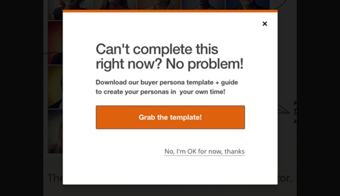
This is a pop-up example that has multiple Call-to-action. In this, MakeMyPersona used a strategic way of using “Grab the Template” in a bright orange color that is in contrast with a white background which would attract the audience to click than the “No, I’m ok for now, thanks” button that doesn’t even look appealing to click. The way they convey “No” in a very polite way is also another impressive factor in the view of the audience.
8. “Download on the App Store” | “Get it on Google Play”- Instagram
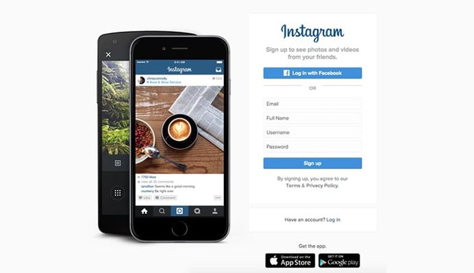
Instagram gives an ideal call-to-action example. As we know, Instagram is mainly used on mobile devices. Here, they have used two black boxes conveying messages “Download on the App Store” and “Get it on Google Play” in which both the CTAs are of equal caliber and it doesn’t mind if a person clicks any of either button as either way Instagram get a download which is exactly what it is optimizing for. There is also a “log in” button for someone who has already an account on Instagram and a “Sign up” button for someone who doesn’t have an account. They have conveyed everything in a straightforward manner which becomes convenient for the users.
9. “Go Premium” | “Play Free” – Spotify
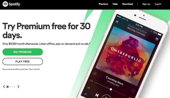
When you visit the homepage of Spotify, it is clearly visible they want to attract people to go for the premium option as it is conveyed in a green color which is in contrast with the white color. They don’t give much importance to play free option as it is conveyed in a white box that goes with the same white background. Here they used the CTA strategy in a way that would attract their viewers to go for the premium option.
10. “Download Now” – HubSpot
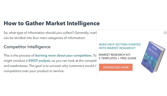
HubSpot offers many free resources which is why there are many users for their website. Here, as we can see there is a slide-in CTA that comes on the way of the article discussing marketing intelligence and how an effective CTA will boost user experience. This slide-in CTA in the midway of the article will prompt people to not only click it but also provide many free tools as well.
Concluding:
The above-mentioned are some examples of CTA which are scientifically successful and you can replicate it on the basis of your content and website that might work. In most cases, CTA might not work on the first attempt which makes it advisable to run one or more A/B testing to determine the strength and effectiveness of the CTA used.
Aviv Digital is one of the leading Digital marketing course in kerala, Kerala. We offer a wide variety of globally recognized certification programs that include SEO, SEM, SMM, Email Marketing and Inbound Marketing courses. For more details, Contact us at: +91 9037 489 577






1 Comment
This content is beneficial for my business. I have a startup providing Digital Marketing Services to small-scale industries. In some situations, I do not get good results/conversion through paid media. This article gives a good idea about how to increase the conversion rate at a low cost. Got an idea about how to convert leads to high-value customers as well.